COVID 19 Data Analysis Using Python Programming : John Hopkins University Covid Data analysis with World Happiness report
Today we are going to analyze the dataset of COVID 19 published by John Hopkins University and World Happiness report. For this, you need to have the basic knowledge of python programming language and some of its libraries like matplotlib, numpy, pandas, and seaborn. You can also make reference to my previous tutorials to learn some of these libraries. The links are provided below:
Now we are going to start coding. At first Open your preferred IDE (Google collab, pycharm, jupyter notebook, etc.). Then let's import the libraries first:
import pandas as pd
import numpy as np
import seaborn as sns
import matplotlib.pyplot as plt
print("All modules imported!")
Check if everything is imported correctly. Now let's load our dataset and check how the dataset looks using the head() method:
corona_dataset_csv = pd.read_csv("Datasets/time_series_covid19_confirmed_global.csv")
corona_dataset_csv.head()
The link to the dataset is given below:
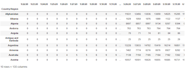
Now we have seen the structure of our COVID 19 dataset. Some of the columns in the dataset like lat, long are not necessary for our analysis. So let's remove the unnecessary columns. Also, Each country have different states and provinces, let's aggregate the data for each country, and have a look at our dataset:
corona_dataset_csv.drop(["Lat", "Long"], axis = 1, inplace = True)
aggregated_corona_dataset = corona_dataset_csv.groupby("Country/Region").sum()
aggregated_corona_dataset.head(10)
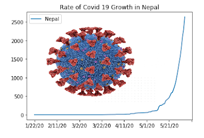
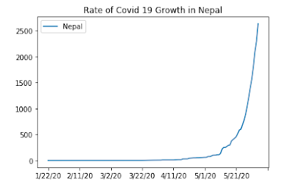
At first, let's check out the data for a country Nepal for instance and let's plot a graph :
aggregated_corona_dataset.loc["Nepal"].plot()
plt.title("Rate of Covid 19 Growth in Nepal")
plt.legend()
Now let's find the maximum corona infection rate and add another column to the data frame. The maximum infection rate can be calculated by calculating the maximum of the derivative of the given data.
countries = list(aggregated_corona_dataset.index)
max_infection_rates = []
for c in countries:
    max_infection_rates.append(aggregated_corona_dataset.loc[c].diff().max())
aggregated_corona_dataset["max_infection_rates"] = max_infection_rates
aggregated_corona_dataset.head()
We only need the name of the countries and the maximum corona infection rate for our analysis so let's create a new data frame with only countries and the maximum corona infection rate.
corona_data = pd.DataFrame(aggregated_corona_dataset["max_infection_rates"])
corona_data.head()
It looks like this:
Now let's import another dataset and look at its structure:
happiness_report_csv = pd.read_csv("Datasets/worldwide_happiness_report.csv")
happiness_report_csv.head()
In the above table, we don't need columns like "Overall rank", "Score", "Generosity", "Perceptions of corruption" for our analysis, So removing unnecessary columns. Also later we need to combine these two datasets. COVID 19 dataset has countries name as Indes so setting countries name as an index for world happiness report dataset also:
useless_cols = ["Overall rank", "Score", "Generosity", "Perceptions of corruption"]
happiness_report_csv.drop(useless_cols, axis = 1, inplace = True)
happiness_report_csv.set_index("Country or region", inplace= True)
happiness_report_csv.head()
The structure looks like this now:
Now, let's join the two datasets. Before that let's check their shape:
It looks like COVID 19 dataset has more number of countries than the world happiness report. So to join these two datasets we need to use inner join which fills the empty country as null.
final_data = corona_data.join(happiness_report_csv, how = "inner")
final_data.head()
The final structure looks like this:
Now let's calculate the correlation matrix for this data. The correlation matrix gives the relation of each column with other columns. You can generate the correlation matrix by using corr() function:
final_data.corr()
The correlation matrix looks like this:
Our analysis is coming to an end. Any data analysis is incomplete without a good visualization of the outputs. So, let's visualize our output. For this purpose, we are going to use regplot() of Seaborn. The relationship between GDP per capita and max infection rate can be visualized as:
x = final_data["GDP per capita"]
y = final_data["max_infection_rates"]
sns.regplot(x,np.log(y)).set_title("Relationship Between Corona Infection Rate and GDP per Capita")
It looks like:
Now Its homework time. I suggest you to visualize other columns vs max infection rate by yourselves.
After analyzing these two datasets the conclusion of our analysis is very interesting. It shows that people living in developed countries are more prone to infection of coronavirus than people living in less developed countries. We can also argue that there are fewer test kits in less developed countries but this is what we absorbed from the collected datasets. I don't guarantee the accuracy of this result.
You can find the GitHub repository of this analysis here.


This is awesome. Keep updating more data science tutorials!!
ReplyDeletePleased to hear that.
ReplyDeleteSure!!